Checkout Trust Signals on Mobile: 17 Small Fixes That Stop Customers From Abandoning (And Why Apps Win in 2026)
Mobile shoppers abandon when checkout feels risky or annoying. Use these 17 trust signals to lift conversion—and see why apps win in 2026.
Inside this article
Why mobile cart abandonment happens (it’s often a trust problem)
On mobile, people are more cautious.
They’re on a small screen, often multitasking, and one “weird” detail can trigger doubt:
- “Will shipping be expensive?”
- “Is this store real?”
- “What if returns are hard?”
- “Is payment safe on mobile?”
The result is predictable:
They leave the cart, telling themselves they’ll come back later.
Most don’t.
The fastest way to fix this is not a full redesign. It’s adding the right trust signals and removing tiny friction points.
17 checkout trust signals you can add this week
These are small changes, but they work because they reduce fear and mental effort.
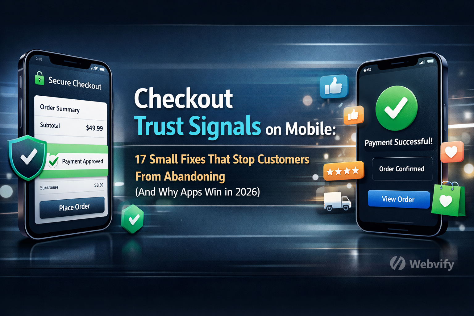
1) Payment method logos (near the Pay button)
Show Visa, Mastercard, PayPal, Apple Pay, Google Pay.
2) Clear delivery estimate (not “3–10 days”)
Give a realistic ETA and show it early.
3) Simple returns policy (one sentence)
Example: “30-day returns. No questions asked.”
4) Shipping cost transparency
Don’t hide shipping until the last step.
5) A visible support link
Add “Need help?” with live chat / email / WhatsApp.
6) Trust badge (use carefully)
SSL / secure checkout icon. Don’t overdo fake badges.
7) Reviews near checkout
Even “4.7 ⭐ (2,140 reviews)” helps.
8) Real address + company info in footer
Small, but it removes “scam” vibes.
9) Guest checkout by default
Account creation is a conversion killer on mobile.
10) Autofill and autocomplete
Address autocomplete and smart keyboard types (email, phone).
11) Fewer form fields
Every extra field is another reason to quit.
12) Progress indicator
“Step 2 of 3” reduces anxiety.
13) Order summary always visible
People abandon when totals feel uncertain.
14) Easy-to-tap buttons
Big, clear CTA buttons. Avoid tiny links.
15) Error messages that help (not punish)
Tell users how to fix the field.
16) Mobile wallet buttons (Apple Pay / Google Pay)
These are trust + speed in one.
17) Optional: a soft exit reminder
If someone leaves checkout, remind them later (email/SMS/push).
Web checkout vs app checkout (trust + friction)
| What customers feel | Mobile Web Checkout | App Checkout |
|---|---|---|
| Payment is safe | Depends on page trust | Strong (wallets + biometrics) |
| Steps feel long | Often longer | Often shorter |
| Typing is annoying | High friction | Lower (saved data) |
| “Will I find this again?” | Uncertain | Home screen icon |
| Checkout speed | Depends on site + browser | Typically faster |
Why apps reduce perceived risk (even if the product is the same)
Apps win because they create a more “official” feeling and they reduce the most painful mobile problems:
- Saved identity (less typing)
- Faster payment (Apple Pay / Google Pay)
- Biometrics (Face ID / Touch ID feel secure)
- Home screen presence (easy to return)
This is why many brands see better conversion and repeat purchases inside an app.
Practical rollout plan (no drama)
Use this order to get quick wins:
- Add wallets (Apple Pay / Google Pay) + payment logos
- Make shipping + returns crystal clear
- Reduce fields + enable autofill
- Add progress indicator + order summary clarity
- Then consider an app for long-term retention
FAQ
Do I need an app to reduce cart abandonment?
No. Many fixes above work on mobile web.
So why build an app at all?
Because it helps with repeat visits, faster checkout, and stronger trust signals.
How fast can I launch an app if my website already works?
With the right tooling, you can convert an existing site into a branded app experience quickly.
Final thought
If your mobile checkout is leaking revenue, you don’t need 50 experiments. You need the right trust signals in the right places.
If you want to turn your existing website into a branded mobile app (and make checkout feel faster and safer), explore Webvify.